
Thursday, December 16, 2010
Thursday, December 9, 2010

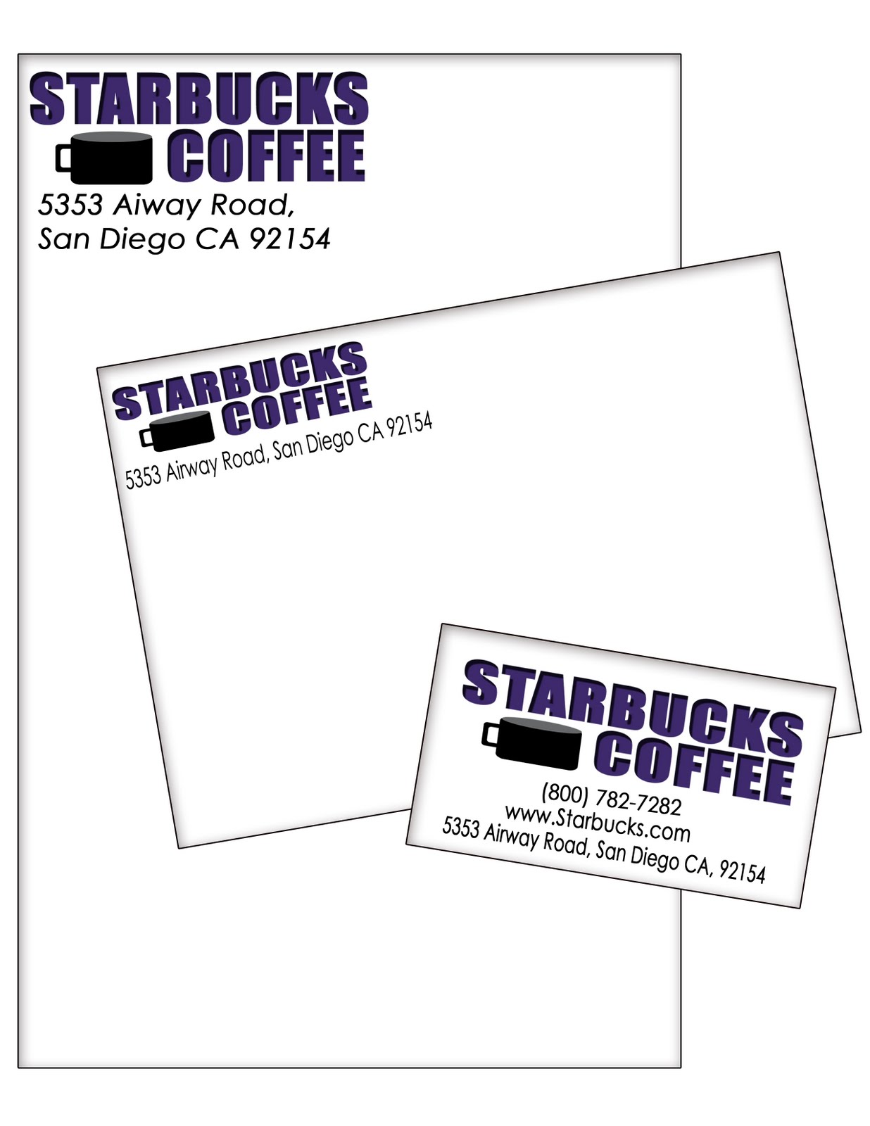
Tuesday, December 7, 2010


Friday, November 19, 2010
Logos Set 2


 In my first set of logos I was looking more at font than shape. I did add a shape of a star to replace the ‘A’ in ‘Starbucks’ to add a little creativity. I did this for the whole set but I changed the style of font and color. On the first design I did more of a solid color. I used the colors green and black to make a simple logo. On the second one I blended orange with pink to add a little more pop of color. On the third design I did the same design but with different shades of blue and grey with black. On my fourth it’s a little similar to the first but changed the design of the star to add a little more shape.
Logos Set 1


 In my second set of logos I focused more on shapes. All four are circles but have different fonts and shapes inside. On my first design I added stars outside along with the label and a cup of coffee inside. On my second design I added the label outside and made a star with different dimensions inside. On my third design I filled the outside with stars and added the label in a circular text inside. On my fourth design I added little stars on the outside with the label and a cup of coffee inside a big star.
Friday, November 5, 2010


Friday, September 24, 2010
Montages
+copy.jpg)
On my second montage I used the same tools as the first one, except in this one I used the layer mask. The layer mask was fun to use and helped make the picture look better. It helped take away all the straight edges and pointy corners. I also overlapped every image to make it a collage.
The theme of this collage is the movie The Notebook. This is one of my absolute favorite movies of all. It’s one of the best love stories. The main actors are Rachel McAdams who plays Allie and Ryan Gosling plays Noah. I also included swans because in one of the scenes Noah takes Allie to a lake that was full of beautiful white swans.
+copy.jpg)
On my first montage I learned how to crop images, change the lighting of an image, make an image fade into the background, and how to overlap. The tool I used the most was the cropping. I used cropping in every image to take away the background and just keep a certain part of the image that I wanted. The tool that I thought was really fun was the gradient tool. The gradient tool helped me fade an image into the background giving it a really cool effect.
The theme of my first montage was music. I have a huge passion for music so in this montage I included my favorite singers which are Lil Wayne, Kid Cudi, and Drake. It shouldn’t look really realistic so I put the images together to try to make it seem that they are rapping on the moon. These three singers have songs about the moon so I thought it fit really well. Also because it gave it a better effect to it.
Thursday, September 2, 2010


Tuesday, August 31, 2010
Thursday, August 26, 2010
Tutorial #18

Tutorial 18 was a little more difficult to do. It was about five steps and it took me a while to do. I couldn’t figure out how to use the mask tool. The background was roses and I had to convert text with that background. After using the mask tool I had to use the move key and move the text down to the bottom left corner. I then had to copy paste it into a new blank background.

Tuesday, August 24, 2010
Tutorial #10
 This is tutorial #10 and it was pretty simple. It was only about two simple steps so it had no difficulty at all. All I had to use was the Elliptical Marquee Tool to outline the eyes and make color adjustments. Using the Elliptical Marquee Tool is a little hard to use because of the sizing of the circle may be hard to get it perfect. It wasn't very difficult but it’s always fun to learn something new.


Tuesday, July 27, 2010
My First Impression
I am excited to have this class this year because i have a huge heart for photography. Ever since i was about 8 years old i had an addiction of taking pictures of people and nature. In this class i expect to learn alot of fun ways to edit my pictures and be creative. I hope to learn alot from this class and be able to use it in the future. Photography is really fun because you can be unique in every little way. A picture can also describe one's feelings or personality. No picture straight out of the camera is perfect so using photoshop will help fix all the little details.
Subscribe to:
Comments (Atom)